RMG new image speaks for itself

We have already talked about our 60th anniversary and the restyling connected therewith. Let’s dig deeper on our choice: what has led us to review our image instead of changing it completely?
One of the main factors was the awareness that, by completely changing our logo, our identity would have had consequences such as a break with our past, which was not our intention.
On the other hand, our project aimed at maintaining our historical brand in its essential features while attributing it a deeper meaning, closer to the reality of our company by means of a logo which:
- Could be easily recognised by our long-term partners;
- Could give a clear image of our company to our new partners in the industry;
- Could comply with our desire for renewal, by highlighting the importance of our origins.
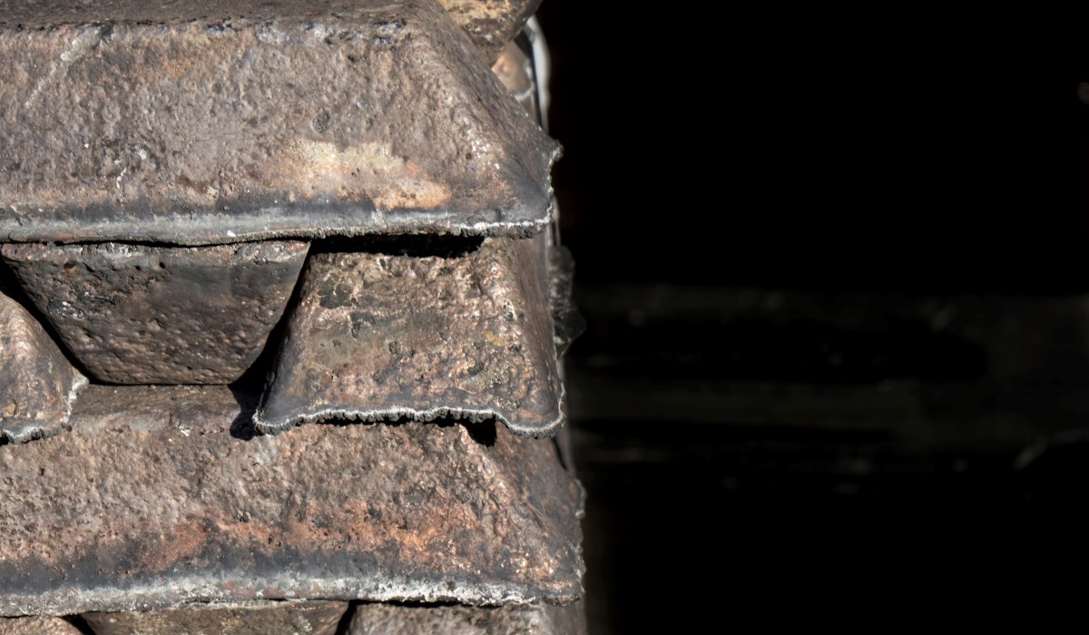
These further observations have led us to the revision of our logo. What about the result? A new tagline was designed for RMG along with a new logo which could preserve its original elements, but which also includes a stylisation of our product: the bronze ingot.